
Is Your Site Legal? A Guide to ADA Compliance Website Design for Small Business
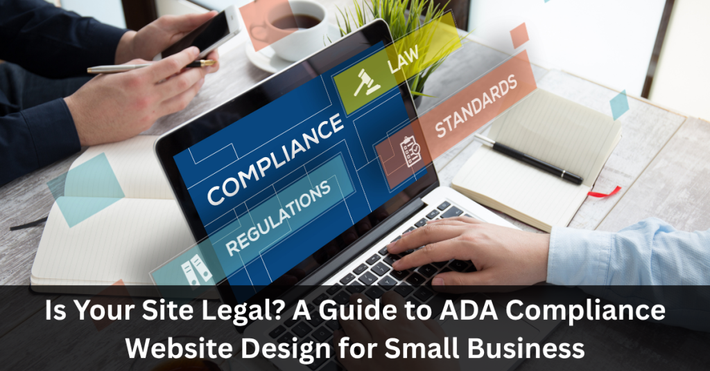
If someone using a screen reader visited your website right now, could they navigate it? Could a person with color blindness read your calls to action? If you’re not sure, you may already have a legal problem — and you might not know it yet. ADA compliance website design isn’t just a box to check. For small business owners, it’s a real legal exposure and a missed opportunity wrapped into one. Lawsuits targeting non-compliant websites have been rising steadily, and small businesses are increasingly in the crosshairs. The good news: getting compliant is more straightforward than most people think, and the payoff goes well beyond avoiding lawsuits. This guide breaks down exactly what ADA compliance means for your website, what’s at stake if you ignore it, and how to fix it — step by step. Key Takeaways What Is ADA Compliance for Websites? The Americans with Disabilities Act (ADA) was signed into law in 1990. At the time, the internet barely existed as a public tool. But courts and the Department of Justice have since interpreted the ADA to cover websites — meaning businesses that operate online must ensure their digital presence is accessible to people with disabilities. What does “accessible” actually mean in practice? The widely accepted standard is the Web Content Accessibility Guidelines (WCAG), currently at version 2.1. Courts and regulators most commonly reference Level AA compliance as the minimum threshold for legal safety. These guidelines cover everything from how images are described to how forms are labeled to how a site responds to keyboard-only navigation. In short: if a person with a visual, auditory, cognitive, or motor disability cannot fully use your website, your site may be in violation of federal law. Why ADA Compliance Matters for Small Businesses Here’s where many small business owners get surprised: the ADA doesn’t only apply to large corporations. If your business is open to the public — even if it operates primarily online — you are likely covered. The legal risk is real. Web accessibility lawsuits have increased significantly over the past several years [source needed], and demand letters from plaintiff attorneys targeting small business websites are common. A single lawsuit can cost tens of thousands of dollars in legal fees, settlements, and site remediation — far more than it costs to become compliant upfront. The business case is equally strong. Roughly 26% of U.S. adults live with some form of disability [CDC data]. That’s a significant portion of your potential customer base. An inaccessible website doesn’t just create legal liability — it turns away customers who can’t use it. For Phoenix businesses competing in a growing, diverse market, accessibility is both a legal requirement and a smart business decision. Key Elements of an ADA-Compliant Website ADA-compliant website design isn’t one single feature — it’s a combination of technical and design standards. Here are the core elements your site needs: 1. Text Alternatives for Images (Alt Text) Every meaningful image on your site needs a written description. Screen readers rely on alt text to describe images to visually impaired users. Decorative images should be marked so screen readers skip them. 2. Keyboard Navigation All functionality on your site — menus, forms, buttons, links — must be operable using a keyboard alone. Many people with motor disabilities cannot use a mouse. 3. Color Contrast Text must have sufficient contrast against its background. The WCAG 2.1 AA standard requires a contrast ratio of at least 4.5:1 for normal text and 3:1 for large text. 4. Captions and Transcripts for Media Any video or audio content needs captions or transcripts so users who are deaf or hard of hearing can access the content. 5. Clear and Consistent Navigation Menus, headings, and page structure should be logical and predictable. Screen readers use heading hierarchy (H1, H2, H3) to navigate a page — out-of-order or missing headings cause real problems. 6. Accessible Forms Every form field needs a visible label. Error messages must be descriptive. Time-limited forms must give users enough time to complete them. 7. No Reliance on Color Alone Don’t use color as the only way to communicate information (e.g., “click the red button”). Always pair color cues with text or icons. Conducting a Website Accessibility Audit Before you can fix anything, you need to know what’s broken. Here’s how to assess your current site: Step 1: Run an Automated Scan Use a free tool like WAVE (Web Accessibility Evaluation Tool) or Google Lighthouse (built into Chrome’s DevTools). Enter your URL and review the report. These tools flag common issues like missing alt text, low contrast, and unlabeled form fields. Important caveat: Automated tools catch roughly 30–40% of accessibility issues [source needed]. They’re a starting point, not a finish line. Step 2: Test with a Keyboard Only Unplug your mouse. Navigate your entire site using only the Tab, Enter, and Arrow keys. Can you access every menu, complete every form, and activate every button? If you get stuck anywhere, that’s a failure point. Step 3: Test with a Screen Reader Try NVDA (free for Windows) or the built-in VoiceOver on Mac/iOS. Navigate through your homepage and a key landing page. Listen for how images are described, how links are announced, and whether the reading order makes sense. Step 4: Check Color Contrast Use the WebAIM Contrast Checker to test your brand colors against your text colors. Paste in your hex codes and see if they pass AA standards. Step 5: Review Your Forms and Media Go through every form and check for visible labels and clear error messages. Review every embedded video — are captions available? Step 6: Document Your Findings Create a simple spreadsheet listing each issue, the page it appears on, the WCAG criterion it violates, and the priority level. This becomes your remediation roadmap. Tools and Resources for Ensuring Compliance You don’t need to hire a team of specialists just to assess where you stand. These tools can help: For small businesses without in-house developers, these tools help identify
Local SEO for Multi-Location Businesses: How to Dominate Phoenix and Beyond

If you run a business with two, five, or fifteen locations across the Phoenix metro area, you already know that showing up in local search results isn’t optional — it’s survival. But here’s the problem most multi-location businesses face: what works for a single-location shop doesn’t scale. You can’t just clone one strategy and paste it across every location and expect Google to reward you for it. Local SEO for multi-location businesses is its own discipline. It requires a coordinated system — one that keeps your brand consistent while also making each location feel genuinely local to the community it serves. Whether you’re a home services company covering Scottsdale, Mesa, and Glendale, or a restaurant group with locations from Tempe to Peoria, this guide will show you exactly how to build that system. Let’s get into it. Key Takeaways What Is Local SEO, and Why Does It Matter for Multi-Location Businesses? Local SEO is the process of optimizing your online presence so your business appears when people search for products or services near them. When someone types “HVAC repair near me” or “best tacos in Scottsdale,” Google uses a combination of relevance, distance, and prominence to decide who shows up. For a single-location business, this is already competitive. For multi-location businesses, the stakes are higher — and the complexity is real. Each location is essentially its own local competitor. Without proper SEO structure, your locations can actually compete against each other in search results, splitting authority and confusing Google’s algorithms. Done right, multi-location search optimization lets every location independently rank in its own market while benefiting from your brand’s overall authority. That’s the goal. Challenges Faced by Multi-Location Businesses Before you can build a winning strategy, you need to understand what’s working against you. 1. NAP Inconsistency: NAP stands for Name, Address, and Phone number. Google cross-references this data across hundreds of directories, review sites, and citations. If your Chandler location is listed as “Phoenix Premier Plumbing” in one place and “Phoenix Premier Plumbing LLC” in another, or if an old phone number is floating around, those inconsistencies erode trust with search engines. 2. Duplicate Content Across Locations: Many businesses create service pages that say the same thing, just with a different city name swapped in. Google sees through this immediately. Thin, templated content doesn’t rank — and it can actively drag your site down. 3. Managing Multiple Profiles and Listings: Each location needs its own Google Business Profile, its own citations, its own review strategy. Without a system, this becomes chaos quickly. 4. Inconsistent Customer Experience: Different locations may have different hours, staff, or services. If your online information doesn’t reflect this accurately, you’ll get poor reviews and lost customers — both of which hurt local rankings. Crafting a Local SEO Strategy for Phoenix Phoenix is one of the fastest-growing metro areas in the country, with distinct neighborhoods and suburbs that each have their own character. A local SEO strategy that treats “Phoenix” as one big market will underperform every time. Here’s how to build a geo-targeted SEO strategy that works at the location level: Step 1: Do Location-Specific Keyword Research Don’t just target broad terms like “plumber Phoenix.” Dig into hyper-local searches like “plumber Gilbert AZ,” “emergency plumber Tempe,” or “drain cleaning Ahwatukee.” Tools like Google’s Keyword Planner, Moz, or Ahrefs can help you identify search volume at the city and neighborhood level. Step 2: Build Dedicated Location Landing Pages Every location should have its own page on your website. Not a generic page with the city name dropped in — a real page with: Step 3: Implement Local Business Schema Schema markup is structured data that tells search engines exactly what your business is, where it’s located, and what it offers. For multi-location businesses, you need LocalBusiness schema on each location page — not just your homepage. This is a technical step, but it pays off in rich search results and better geographic targeting. Step 4: Optimize for “Near Me” and Voice Search A significant portion of local searches happen on mobile and through voice assistants. Phrases like “best pizza near me” or “HVAC company open now” are common. Make sure your location pages and Google Business Profiles have complete, accurate information — especially hours of operation and service categories. Google My Business Optimization for Multiple Locations Your Google Business Profile (formerly Google My Business) is arguably the most important piece of real estate in local search. For multi-location businesses, getting this right at scale takes deliberate effort. Setting Up Individual Profiles Each physical location needs a separate, verified Google Business Profile. Don’t consolidate them. Google specifically supports multi-location management through its Business Profile Manager dashboard, which lets you manage all profiles from one login. What to Optimize in Each Profile Review Management Strategy Reviews are a confirmed local ranking factor. Build a consistent system for asking customers to leave reviews at the specific location they visited — not just your main business page. Respond to every review, positive or negative. This signals to Google (and potential customers) that you’re an active, engaged business. Leveraging Local Citations and Listings A citation is any online mention of your business’s NAP information. Citations exist on directories like Yelp, Angi, the Better Business Bureau, Houzz (for home services), TripAdvisor (for restaurants), and hundreds of niche and regional directories. Why Citations Matter Search engines use citation data to verify that your business is legitimate and located where you say it is. More consistent, high-quality citations = more trust = better rankings. How to Manage Citations at Scale For multi-location businesses, manual citation management becomes unsustainable fast. Tools like BrightLocal, Whitespark, or Moz Local allow you to push accurate information to dozens of directories simultaneously and flag inconsistencies. Priority citation sources for Phoenix businesses: Audit your existing citations before building new ones. Fix the bad data first. Content Marketing for Local Reach Generic content doesn’t win in local search. If you want to rank in Mesa, you need content that talks
The Psychology of Website Conversions: Design Hacks That Drive More Leads

Every click, scroll, and tap on a website represents a psychological decision. The difference between a visitor who leaves and a visitor who converts often comes down to how well a website is designed to tap into human psychology. In today’s competitive digital space, understanding the psychology of website conversions isn’t just a nice-to-have—it’s essential for driving more leads, sales, and long-term growth. From subtle color choices to persuasive call-to-action (CTA) placement, every design decision can either move users closer to conversion or push them away. But what truly influences these decisions? The answer lies in human behavior, emotions, and cognitive biases. In this article, we’ll explore the psychological principles behind conversions, uncover design hacks that consistently boost engagement, and highlight real-world examples of businesses that have mastered the art of persuasive design. Understanding the Psychology Behind Conversions Cognitive Biases That Influence Online Behavior Humans are not purely logical decision-makers. We rely on cognitive shortcuts known as biases to make choices quickly. On websites, these biases play a major role: The Role of Emotions in Decision-Making Neuroscience research shows that 90% of decisions are driven by emotions rather than logic. Websites that evoke trust, excitement, or urgency tend to convert better. For instance, a travel website using aspirational images of tropical beaches can spark emotional desire before the user even looks at prices. Social Proof and Its Impact on Trust Humans are wired to follow the crowd. Social proof—such as testimonials, case studies, and user-generated content—acts as psychological validation. When potential buyers see that others have purchased, subscribed, or engaged positively, they feel safer doing the same. Key Psychological Triggers in Web Design Scarcity and Urgency: The Fear of Missing Out (FOMO) Nothing drives conversions like the fear of missing out. Limited-time offers, countdown timers, and stock scarcity messages all tap into this psychological trigger. For example, an e-commerce site displaying “Only 3 items left in stock” can push hesitant buyers to act immediately. Reciprocity: Giving Before You Ask When businesses provide value upfront—such as free eBooks, trials, or webinars—users feel compelled to return the favor. This principle of reciprocity increases the likelihood of signing up, purchasing, or sharing content. Authority: Building Credibility Through Design People naturally defer to authority figures. Badges like “As Seen On Forbes” or endorsements from industry leaders enhance trust. Similarly, a professional, polished design signals authority compared to a cluttered, outdated website. Simplicity: Why Less is More in UX Overloading users with too much information can backfire. A clean, minimalist design makes navigation intuitive and decision-making effortless. Think of Apple’s website: sleek, simple, and laser-focused on highlighting product benefits. Design Hacks That Boost Conversions Color Psychology: Choosing the Right Palette Colors evoke emotions and influence user behavior. For instance: Strategic Use of White Space and Layout Cluttered designs overwhelm users, while white space creates balance and directs focus. Proper spacing around CTAs ensures they stand out and get clicked. Persuasive CTAs: From Words to Placement The language, color, and placement of call-to-action buttons can make or break conversions. Instead of generic “Submit,” phrases like “Get My Free Guide” or “Start Saving Today” perform significantly better. Visual Hierarchy: Guiding the User’s Eye Good design naturally directs attention. Using bold headlines, contrasting CTA buttons, and high-quality visuals ensures that users are guided down the intended conversion path. The Role of Typography in Readability and Engagement Typography affects readability, which directly impacts engagement. Sans-serif fonts often feel modern and clean, while serif fonts add sophistication. Consistency in font size and spacing also improves user experience. Advanced Conversion Strategies A/B Testing and Data-Driven Design Even the best design is only as good as its performance. A/B testing allows businesses to test two or more variations of a webpage to see which drives more conversions. Whether it’s testing CTA colors, headlines, or layouts, the data reveals what users actually prefer—not just what designers assume. For example, a SaaS company might test “Start Your Free Trial” against “Try It Free for 14 Days.” The more effective wording can increase conversions by 20% or more. Personalization and Behavioral Targeting Today’s users expect personalized experiences. By leveraging behavioral data, websites can tailor messages, product recommendations, and offers based on individual browsing patterns. Amazon excels at this—its recommendation engine alone contributes a significant percentage of its revenue. Mobile-First Design for Modern Users With mobile devices accounting for over 60% of global web traffic, websites must be designed with mobile-first principles. A responsive, fast, and thumb-friendly layout not only improves user experience but also directly impacts conversions. Speed and Performance Optimization Studies show that a 1-second delay in page load time can reduce conversions by 7%. Optimizing images, using caching, and leveraging content delivery networks (CDNs) can significantly improve site speed, keeping users engaged and reducing bounce rates. Common Mistakes That Kill Conversions Overloading Users with Too Much Information Websites often fall into the trap of trying to showcase everything at once. This leads to clutter, confusion, and decision fatigue. Instead, businesses should focus on a clear value proposition and a single primary CTA per page. Ignoring Mobile Responsiveness A desktop-only design alienates a huge portion of mobile users. Pinch-to-zoom frustration, slow load times, or broken layouts drive visitors away before they even consider converting. Weak or Misaligned Call-to-Actions A poorly worded or misplaced CTA is one of the fastest ways to lose conversions. CTAs must be action-oriented, benefit-driven, and visible at multiple touchpoints across the site. FAQs on Website Conversion Psychology Q1: What is the psychology of website conversions? The psychology of website conversions is the study of how design, content, and user experience influence visitor behavior and decision-making to increase actions like sign-ups, purchases, or downloads. Q2: How can color psychology improve conversions? Colors trigger emotional responses. For example, red can create urgency, blue builds trust, and green promotes positive action. Choosing the right palette can guide users toward desired actions. Q3: Why are CTAs so important for conversions? CTAs serve as the direct path to conversion. Well-designed, persuasive CTAs tell users