

Designing a website that performs flawlessly on both mobile and desktop devices has never been more critical. With an ever-growing number of users accessing content on diverse platforms, responsive design is at the heart of a successful online presence. In today’s digital landscape, a seamless and engaging user experience can set you apart from the competition and significantly impact your SEO rankings.
Responsive design is not just about aesthetics; it’s a strategic approach that involves understanding user behavior, optimizing for speed, and ensuring that content is accessible regardless of the device. Whether you’re targeting local customers for water damage restoration, promoting security guard services, or showcasing custom cabinetry projects, having a website that adapts to various screen sizes is crucial for delivering value and achieving measurable results.
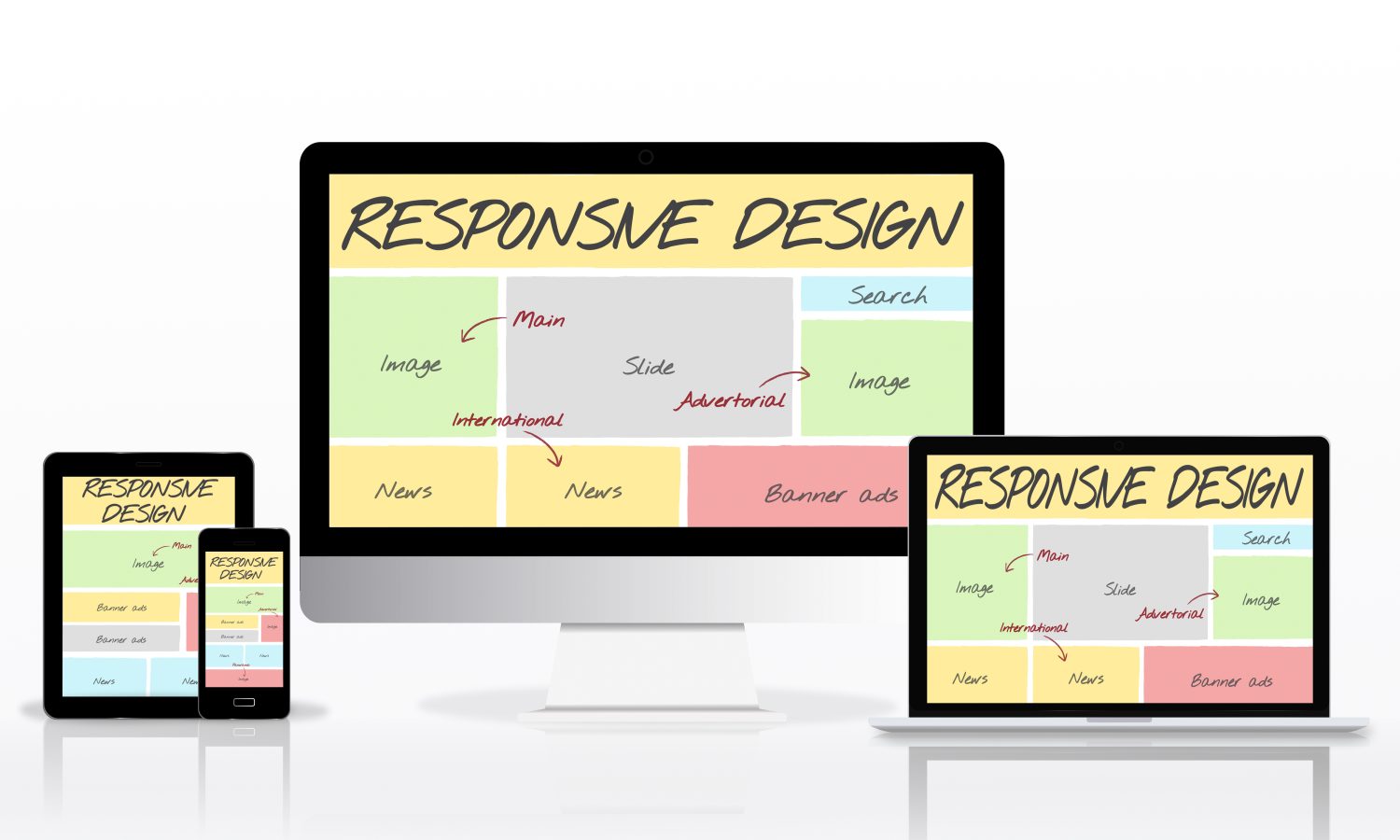
In this article, we explore the ultimate 10 steps to design a website that excels on both mobile and desktop. We’ll delve into the principles of responsive design, discuss mobile-first strategies, and highlight the differences and nuances of designing for desktop users. Additionally, we will cover the essential tools and technologies needed, as well as SEO and performance optimization tactics that can elevate your site’s user experience and search engine visibility.
Key Principles of Responsive Design
Responsive design is built on a set of core principles that allow websites to adapt seamlessly across various devices. These principles include fluid grid layouts, flexible images and media, and the use of CSS media queries. Each of these elements plays a crucial role in ensuring that your site looks great on both mobile and desktop devices.
Fluid Grid Layouts
Fluid grid layouts use relative units like percentages instead of fixed pixel values, ensuring that the design adjusts smoothly to different screen sizes. This dynamic adjustment is essential for maintaining the integrity of your layout as users switch from a large desktop monitor to a smaller smartphone screen. A fluid grid system allows for scalability and flexibility, which is especially important when you’re catering to industries where visual impact and clarity are paramount.
Flexible Images and Media
Images and other media need to be responsive as well. Using CSS techniques to ensure that images resize correctly within their containers can prevent them from breaking the layout or causing performance issues. Techniques such as setting the image width to 100% or using the srcset attribute in HTML can help deliver optimal image quality without sacrificing speed or usability.
CSS Media Queries
Media queries are the backbone of responsive design. They allow developers to apply different CSS rules based on the device’s characteristics, such as screen width, resolution, and orientation. By tailoring your styles for various devices, you can ensure that the user experience remains consistent and visually appealing regardless of where the site is viewed.
Progressive Enhancement
Progressive enhancement ensures that your website provides a basic, functional experience for all users, while more advanced features are delivered to browsers that support them. This approach is essential for reaching a wider audience, including users with older devices or slower internet connections, without compromising on performance or design quality.
Implementing these key principles requires thoughtful planning and a willingness to adapt. By starting with a strong foundation in responsive design, you can create a website that not only looks good but also performs efficiently across all devices. This strategy becomes particularly valuable when targeting diverse audiences in sectors such as home improvement or security services, where clarity and speed can significantly influence user engagement and conversions.
Mobile-First Design Strategies
In the mobile-first era, designing for mobile devices is not an afterthought—it’s the primary focus. With mobile internet usage consistently outpacing desktop traffic, the mobile-first approach prioritizes the needs of mobile users, ensuring that the design is simple, efficient, and user-friendly from the outset.
Understanding Mobile User Behavior
Mobile users tend to interact with websites differently than desktop users. They look for quick, easily digestible content and intuitive navigation. Designing with mobile users in mind involves understanding their behavior patterns, such as the preference for scrolling over clicking, the need for larger tap targets, and the desire for rapid loading times. This insight is crucial for developing a user interface that resonates with your target audience, whether they are searching for immediate home repair services or looking up security solutions on the go.
Minimalist Design and Navigation
A minimalist design approach can significantly enhance the mobile experience. By stripping down unnecessary elements and focusing on essential content, you can create a streamlined interface that is both visually appealing and functional. Simplified navigation menus, clear call-to-actions, and ample white space help users focus on the most important aspects of your website. For instance, a custom cabinetry site can benefit from a minimalistic design that highlights high-quality images of products and clear descriptions without overwhelming the visitor.
Performance Optimization
Mobile devices often have less processing power and slower internet connections compared to desktops. Therefore, optimizing for performance is crucial. Techniques such as lazy loading images, minimizing HTTP requests, and leveraging browser caching can make a significant difference in load times. Faster load speeds not only improve the user experience but also contribute positively to your SEO efforts. When your site loads quickly, both users and search engines view it more favorably.
Touch-Friendly Elements
Designing for touch is another critical aspect of mobile-first design. Buttons, links, and interactive elements need to be large enough and spaced appropriately to prevent accidental taps. Implementing a touch-friendly design ensures that users can interact with your site effortlessly, which is especially important for service-oriented businesses where immediate action may be required, such as booking a water damage assessment or scheduling a consultation for security services.
Content Prioritization
With limited screen real estate on mobile devices, content must be prioritized effectively. Place the most important information—such as value propositions, contact details, and primary calls-to-action—above the fold. This strategy not only enhances the user experience but also improves conversion rates by making it easy for users to take the next step.
Adopting a mobile-first design strategy means rethinking every element of your website with a focus on simplicity and speed. It involves iterative testing and refinement to ensure that the mobile experience is as robust and engaging as its desktop counterpart. As you design for mobile, consider employing tools like responsive testing frameworks and analytics platforms to gather insights and continually refine the user experience.

Designing for Desktop Experiences
While mobile-first design is essential, the desktop experience remains equally important, especially for users who require more detailed information and complex interactions. Designing for desktops involves creating layouts that leverage larger screens, offering enhanced navigation, richer content, and sophisticated visual hierarchies.
Enhanced Layout Complexity
Desktop designs provide the opportunity to incorporate more complex layouts without overwhelming the user. With additional screen space, you can afford to include multiple columns, detailed menus, and expansive imagery. For industries such as home improvement and custom cabinetry, this means you can showcase intricate details and high-resolution images that highlight craftsmanship and design excellence.
Detailed Navigation Systems
Desktop users often expect more robust navigation systems. While mobile navigation tends to be simplified, desktop sites can feature multi-tier menus, drop-downs, and sidebar navigation that allow users to explore content more deeply. This structure is particularly beneficial when presenting extensive portfolios or a variety of services. For example, a security service website can include dedicated sections for different service offerings, client testimonials, and detailed case studies.
Visual Hierarchy and Content Prioritization
On desktop, the visual hierarchy can be more pronounced. Effective use of typography, color contrast, and spatial arrangement helps guide the user’s eye through the content. Prioritizing key information and calls-to-action ensures that important messages stand out. For websites in competitive niches, such as water damage restoration, establishing a clear visual hierarchy can significantly improve conversion rates by directing users to critical contact information or service details.
Accessibility Considerations
Designing for desktops also involves ensuring that your site is accessible to all users, including those with disabilities. Incorporate accessible design practices such as keyboard navigation, screen reader compatibility, and high-contrast text options. These enhancements not only improve usability but also demonstrate a commitment to inclusivity, which can be a valuable differentiator in industries where trust and reliability are paramount.
Content-Rich Pages
Desktop users often engage with content more deeply, which means that content-rich pages can be highly effective. Long-form articles, detailed service pages, and multimedia content are best suited to the desktop experience. This approach allows you to provide comprehensive information, answer user questions, and build authority in your niche. For example, a blog on custom cabinetry can delve into design trends, material selection, and installation tips—information that both educates and inspires potential clients.
Integrating Interactive Elements
Desktop designs can incorporate interactive elements that enhance user engagement. Features like sliders, interactive infographics, and video backgrounds can be used to create a more immersive experience. These elements should be designed thoughtfully to ensure they complement the content rather than distract from it. An interactive gallery or virtual tour, for instance, can be particularly appealing for home improvement projects, giving users a detailed look at finished works.
Tools and Technologies for Multi-Device Design
A successful responsive design strategy relies heavily on selecting the right tools and technologies. From frameworks and content management systems (CMS) to prototyping and testing tools, having the proper digital toolkit is essential for streamlining your workflow and achieving consistent results across devices.
Frameworks and Libraries
Modern web development benefits from a wide array of frameworks and libraries that simplify the process of building responsive websites. Frameworks like Bootstrap and Foundation provide pre-built components and a grid system that accelerates development. These tools help ensure consistency in design while allowing for customization to suit industry-specific needs, such as those in water damage restoration or custom cabinetry.
Content Management Systems (CMS)
A robust CMS like WordPress, Joomla, or Drupal can significantly ease the management of responsive content. Many of these systems offer themes and plugins designed with responsive design in mind, which means you can quickly implement mobile-friendly layouts without extensive coding. Additionally, CMS platforms provide scalability—vital for businesses that require regular content updates and feature expansions.
Prototyping and Wireframing Tools
Before diving into full-scale development, it’s crucial to plan your design through prototyping and wireframing. Tools like Sketch, Adobe XD, and Figma allow you to create interactive mockups that simulate the responsive behavior of your website. These tools are invaluable for visualizing how your design will adapt to various screen sizes and for identifying potential usability issues early in the development process.
Responsive Testing Tools
Ensuring that your website functions well across all devices requires rigorous testing. Tools such as BrowserStack and Responsinator provide a simulated environment for testing your website on different browsers and devices. Regular testing allows you to pinpoint design inconsistencies and performance bottlenecks, ensuring a uniform user experience regardless of the platform.
Integrating External Resources
Utilizing external resources such as detailed guides from the W3C or insights from Smashing Magazine can provide additional expertise and best practices. These sources offer up-to-date information and real-world examples that can enhance your approach to multi-device design.
Workflow Automation
To further streamline the development process, consider integrating workflow automation tools. Automation can handle tasks such as image optimization, CSS minification, and even responsive testing scripts, saving you time and ensuring consistency. This is particularly beneficial when managing large websites or multiple projects concurrently.

SEO and Performance Optimization
Optimizing your website for search engines and user performance is a crucial component of responsive design. A site that loads quickly integrates keywords naturally, and provides a satisfying user experience is more likely to rank well and drive engagement.
Keyword Integration Strategies
A smart approach to SEO involves integrating your target keyword—mobile and desktop—strategically within the content. Place the keyword in the first 10% of the content, include it in at least one subheading, and sprinkle it 2-3 times throughout the article. This balanced approach ensures that search engines recognize the relevance of your content without over-optimizing.
Page Speed and Performance
Performance optimization is directly linked to SEO success. Fast-loading pages contribute to a better user experience, lower bounce rates, and higher search rankings. Techniques such as compressing images, leveraging browser caching, and minimizing JavaScript and CSS files are essential for ensuring that your site performs well on both mobile and desktop devices.
Mobile and Desktop SEO Best Practices
Beyond speed, focus on ensuring that your content is accessible and navigable on all devices. Responsive design inherently supports these best practices, but it’s important to continuously audit your site for broken links, outdated content, or design elements that may hinder usability. Regular performance tests and SEO audits help maintain a healthy balance between user experience and search engine requirements.
User Experience Signals
User engagement metrics, such as time on page, bounce rate, and conversion rates, serve as important signals to search engines. By designing an interface that is both visually appealing and functionally intuitive, you encourage users to explore your site further, ultimately improving your SEO performance. A seamless, responsive design creates a positive experience that drives organic traffic and fosters brand loyalty.
Performance Optimization Tools
Utilize performance monitoring tools like Google PageSpeed Insights and GTmetrix to measure your website’s speed and identify potential issues. These insights allow you to make data-driven decisions, ensuring that your site is continually optimized for the best possible performance across devices.
Implementing these SEO and performance strategies creates a virtuous cycle: a faster, more engaging website attracts more visitors, which in turn sends positive signals to search engines, further boosting your rankings. Whether you’re a local business specializing in water damage restoration or a security firm looking to enhance your online presence, these tactics provide a solid foundation for long-term digital success.
Testing, Analytics, and Iteration
The design process doesn’t end at launch—continuous testing, analytics, and iterative improvements are key to maintaining a successful website. Regularly reviewing performance data and user feedback ensures that your site evolves in line with changing user needs and technological advancements.
Device and Browser Testing
Ensure that your website performs consistently across all devices and browsers. Utilize tools like BrowserStack for cross-device testing and conduct regular audits to identify any inconsistencies or issues. This rigorous testing is essential for delivering a uniformly positive user experience.
A/B Testing for User Experience
A/B testing allows you to experiment with different design elements and user flows to see which options perform best. By testing variations of key elements—such as call-to-action buttons, navigation layouts, and content placements—you can fine-tune your design based on real user behavior and feedback.
Data-Driven Iterations
Integrate analytics platforms like Google Analytics to track user behavior and identify areas for improvement. Analyzing metrics such as page views, click-through rates, and conversion paths provides valuable insights into how users interact with your website. Use this data to make informed, iterative improvements that enhance both performance and usability.
Feedback Mechanisms
Incorporate user feedback channels, such as surveys or on-page comment sections, to gather qualitative insights. This direct feedback can reveal pain points or opportunities that data alone might not uncover. In industries like custom cabinetry, where design details are crucial, user feedback can help refine both aesthetics and functionality.
Continuous Improvement Culture
Adopting a culture of continuous improvement means that every update or iteration is an opportunity to enhance the overall user experience. Regularly schedule performance audits, update outdated content, and stay informed about the latest design trends and technologies. This proactive approach ensures that your website remains competitive and relevant over time.
Frequently Asked Questions (FAQs)
Why is responsive design crucial for modern websites?
Responsive design ensures that your website delivers a consistent, user-friendly experience across all devices. It improves usability, supports SEO, and adapts to changing user behaviors—making it essential for any digital strategy.
How can I ensure fast page load times on both mobile and desktop?
Implement image optimization, use caching, minimize HTTP requests, and leverage tools like Google PageSpeed Insights to monitor and improve your site’s performance.
What are the best tools for responsive design testing?
Tools such as BrowserStack, Responsinator, and built-in browser developer tools are excellent for testing your website across various devices and browsers to ensure consistency.
How do I balance SEO with design considerations?
Integrate target keywords naturally, prioritize page speed, and focus on user experience. Consistently audit your website using SEO tools to maintain a balance between visual design and technical performance.
How often should I update my website’s design and content?
Regular updates are recommended—ideally, perform quarterly reviews to keep content fresh and design elements aligned with the latest trends and user feedback.
What role does mobile-first design play in SEO?
Mobile-first design directly influences SEO since search engines prioritize mobile-friendly websites. Optimizing for mobile not only improves user experience but also boosts your search engine rankings.
Conclusion
Designing a website for both mobile and desktop platforms requires a balanced approach that integrates responsive design principles, mobile-first strategies, and desktop-specific enhancements. By following these ultimate 10 steps, you can create a robust, high-performing site that caters to diverse user needs and supports your broader SEO and digital marketing goals.
Remember, the journey doesn’t end with the launch of your website. Continuous testing, iterative improvements, and data-driven decisions are key to maintaining a competitive edge. Whether you’re in water damage restoration, security guard services, or custom cabinetry, a well-designed website can drive measurable results and significantly enhance your online presence.
Embrace the power of responsive design by leveraging modern frameworks, robust CMS platforms, and the latest performance optimization techniques. By doing so, you not only create a visually compelling website but also build a foundation that adapts seamlessly to evolving digital trends and user expectations.
Ready to elevate your online presence?
Partner with Phoenix Premier Digital Marketing & Web Design for expert website design, SEO services, and full-scale digital strategies tailored to your industry. Let us help you turn clicks into clients—Call us now: (480) 442-9829!