

Good lead generation website design gives every visitor an easy, obvious next step on every page, not just a “Contact Us” page at the end of the menu. That step might be a call, a short form, a booking, a quote request, or a text. Then it makes sure someone answers fast.
We read five guides that rank for this keyword in November 2026. None mentioned Google Business Profile. None said how fast to answer a new lead. Only one recommended a spot for the phone number in the header. This guide covers all three. Below are the 12 elements that turn a website into a lead source, grouped into four stages: first impression, trust, capture, and follow-up. It’s written for business owners, especially local service businesses whose best leads still pick up the phone.
Key takeaways
- A lead generation website is built around one question: what should this visitor do next? Every page needs a clear answer.
- For local service businesses, the phone number can be the most important lead path. Make it tappable and keep it visible on mobile.
- Forms convert better when they’re short, explained, and mobile-friendly. Ask only what you need to call someone back.
- Offer more than one way in: a call, a form, a booking or quote option, and chat or text where it fits.
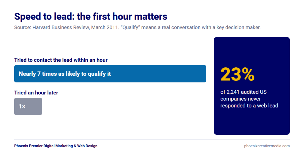
- The website’s job doesn’t end at “Submit”. Answer fast. In a Harvard Business Review study, firms that tried to contact a lead within an hour were nearly 7 times as likely to qualify it.
- Track every lead path (calls, forms, bookings) so you know which ones work.
What is a lead generation website?
A lead generation website is a site designed to turn visitors into inquiries: phone calls, form submissions, bookings, or quote requests that a business can follow up on. Looking good is part of it, but the real measure is how many real conversations it starts.
Here’s how it differs from a website that relies on a contact form alone:
| Contact-form website | Lead generation website | |
| Main goal | Wait for people to reach out | Start a conversation with a buyer |
| Ways in | One “Contact Us” page | A next step on every page (call, form, book, quote) |
| Reason to act | “Get in touch” | A specific offer: a quote, an estimate, a booking or a guide |
| Phone number | In the footer | Tappable in the header and sticky on mobile |
| Form | Long, generic | Short, specific, explains why it asks |
| Proof | A testimonials page | Reviews and guarantees next to every ask |
| After the form | “Thanks, we’ll be in touch” | A thank-you page with next steps and a fast callback |
| Measurement | Page views | Calls, forms and bookings tracked as key events |
If your site gets visitors but few inquiries, it’s probably built like the left column. The rest of this guide moves it to the right.
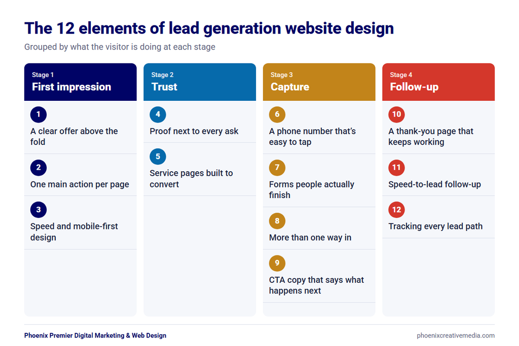
The 12 elements of lead generation website design at a glance
| # | Element | Stage | The question it answers |
| 1 | A clear offer above the fold | First impression | “Am I in the right place?” |
| 2 | One main action per page | First impression | “What should I do here?” |
| 3 | Speed and mobile-first design | First impression | “Will this work on my phone?” |
| 4 | Proof next to every ask | Trust | “Can I trust them?” |
| 5 | Service pages built to convert | Trust | “Do they do exactly what I need?” |
| 6 | A phone number that’s easy to tap | Capture | “Can I just call?” |
| 7 | Forms people actually finish | Capture | “Is this quick and safe?” |
| 8 | More than one way in | Capture | “Can I reach them my way?” |
| 9 | CTA copy that says what happens next | Capture | “What do I get if I click?” |
| 10 | A thank-you page that keeps working | Follow-up | “What happens now?” |
| 11 | Speed-to-lead follow-up | Follow-up | “Will anyone answer?” |
| 12 | Tracking every lead path | Follow-up | “Which pages bring us leads?” (the owner’s question) |
Stage 1: The first impression
Users often leave a web page in 10 to 20 seconds, Jakob Nielsen wrote in September 2011. A clear offer can hold them much longer. These three elements make that first glance work.
1. A clear offer above the fold
The top of each page should say what you do, who it’s for, and where, plus one obvious next step. If a visitor has to scroll to find out whether you serve their area or offer their service, you risk losing them first.
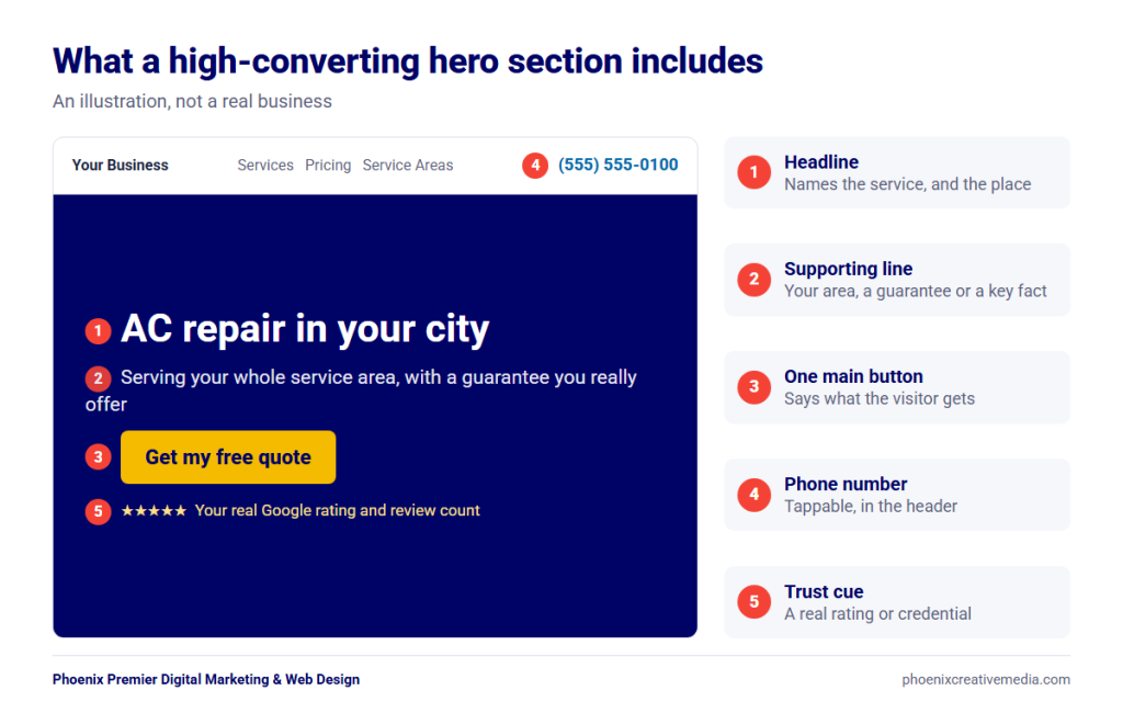
A strong hero section has:
- A headline that names the service and the result (“AC repair in Mesa, same-day when you call before noon” only if that’s true for you)
- One line of support: your area, a guarantee or a key fact
- One main button and, for local businesses, a phone number
- A trust cue close by: a star rating, a review count or a short credential
Skip the vague slogans. “Excellence in every project” tells a visitor nothing. “Kitchen and bathroom remodeling in Scottsdale” tells them they’re in the right place.
2. One main action per page
Every page should have one main action. Secondary options are fine, but they shouldn’t compete with it. When a page offers five equal buttons, the visitor has to stop and work out which one matters.
Decide the main action by page type:
- Service pages: call or request a quote
- Blog posts: a related service page, a free resource, or a newsletter sign-up
- About page: book a consultation
- Contact page: the form and the phone number, side by side
Repeat the main action down the page, especially after a section that builds trust (reviews, a guarantee, a process). Keep the menu short and plain too: name pages by what people look for (“AC Repair”, “Pricing”, “Service Areas”), and put the main action button in the header. Our guide to how to design a website that converts covers the layout side of this in more depth.
3. Speed and mobile-first design
Speed affects whether visitors reach your form at all. So design for the phone first, then scale up to desktop. A study by 55 and Deloitte, paid for by Google, looked at 37 brand sites that got 0.1 seconds faster on mobile across the whole visit. On lead generation sites, up to 21.6% more users moved on to the form submission page.
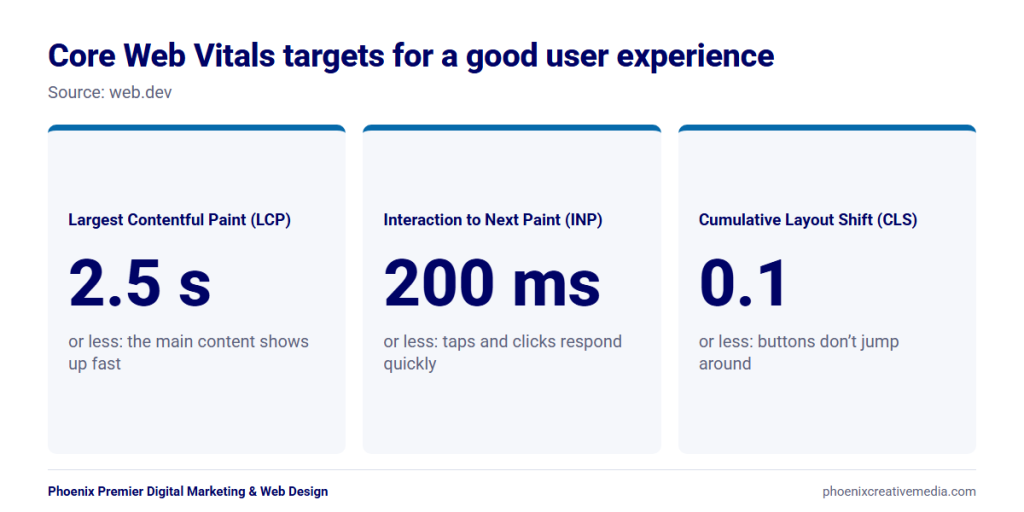
Google’s Core Web Vitals give you clear targets. A good user experience means:
- Largest Contentful Paint (LCP) within 2.5 seconds: the main content shows up fast
- Interaction to Next Paint (INP) of 200 milliseconds or less: taps and clicks respond quickly
- Cumulative Layout Shift (CLS) of 0.1 or less: buttons don’t jump around while the page loads
On mobile, make buttons big enough to tap. The WCAG 2.2 accessibility guideline sets a minimum target size of 24 by 24 CSS pixels, and bigger is better for your main buttons. Keep forms to one column, and keep pop-ups from covering the call button.
Stage 2: Trust
People don’t hand over their phone number to a business they’re unsure about. These two elements remove the doubt.
4. Proof next to every ask
Put proof right beside the button or form, not on a separate testimonials page nobody opens. The moment someone decides whether to inquire is the moment they need reassurance. BrightLocal’s 2026 survey of 1,002 US adults found that 97% of consumers read reviews for local businesses.
Good proof near a CTA includes:
- A short review with the customer’s first name and city
- Your Google rating and review count
- A guarantee or warranty you really offer
- Licenses, insurance, or credentials, if your industry has them
- Photos of real work or your real team, not stock images
Only use proof you can back up. Made-up badges or inflated numbers hurt trust once someone checks. Fake reviews also carry legal risk. In August 2024, the FTC announced a final rule banning them, with civil penalties for people who knowingly break it.
How Phoenix Premier does this: our web design and HVAC pages show our Google rating (5.0 of 5, based on 79 reviews, as displayed in November 2026) just above the request form.
Our post on web design for trust covers security, SSL, and branding signals that support this.
5. Service pages built to convert
Service pages are where visitors land when they already know what they need, so treat them as lead pages, not just descriptions. One page per service (and, where it makes sense, per city) answers each visitor’s need more directly than one page listing everything.
A service page that converts answers, in order:
- What the service is and who it’s for
- The problems it solves, in the customer’s words
- How it works (your process, step by step)
- What it costs, or what affects the price
- Proof: reviews, photos, guarantees
- FAQs that handle common worries
- The next step, repeated.
City pages work the same way for local searches. We explain why every Arizona business needs city-specific landing pages.
If you run ads or a campaign, send that traffic to a focused landing page instead of your home page. Match the headline to the ad, remove anything that pulls attention from the one action you want, and keep the same proof and lead paths.
Stage 3: Capture, beyond the contact form
This is where most websites put a single form and stop. A lead generation website gives visitors the way in that suits them.
6. A phone number that’s easy to tap
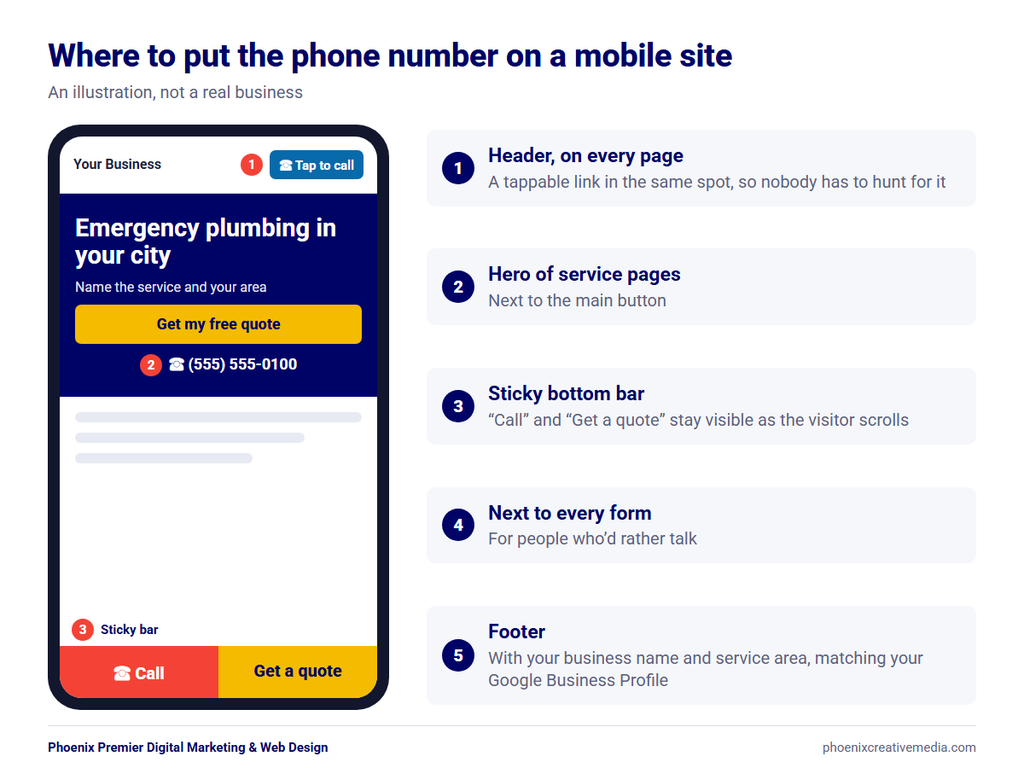
For local service businesses, the phone number belongs in the top right of the header on every page, as a tappable click-to-call link, and in a sticky call bar on mobile. Someone with a leaking pipe or a broken AC usually wants an answer now, and for many of them that means a call, not a form.
Where to put the phone number:
- Header, top right, on every page. Keep it in the same spot so visitors never have to hunt for it.
- A sticky bottom bar on mobile with “Call” and “Get a quote” buttons.
- Inside the hero section of service pages, next to the main button.
- Next to every form, for people who’d rather talk.
- In the footer, with your business name and service area, matching your Google Business Profile.
Make it a real tel: link in international format (for example, tel:+14804429829) so one tap dials it. A phone number shown as an image, or as text that can’t be tapped, makes mobile visitors copy it by hand.
If you run ads or several marketing channels, call tracking numbers can show which source each call came from. Use them carefully. Google’s Business Profile guidelines say the number must be under the business’s direct control, and your main number should stay the same across your website and listings.
A tappable number only works if someone picks up. Rubecca Worlock’s Google review of Phoenix Premier points this out. She wrote that Robert “answers his phone whether it is 8 AM or 8:30 pm.” That’s one customer’s view, but it shows what a reachable phone line can mean to a buyer.
How Phoenix Premier builds this: our HVAC website design projects include custom lead forms, click-to-call buttons, and live chat integrations, with calls to action that ask visitors to request service or schedule an estimate.
7. Forms people actually finish
Keep forms short, explain why you ask for anything personal, and make them easy to fill in on a phone.
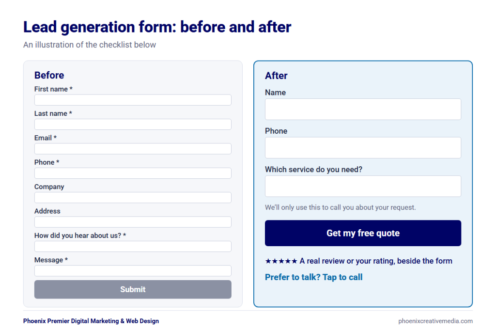
Here’s a checklist for forms that get finished:
- Ask only what you need to follow up. For most service inquiries, that’s name, phone or email, and a short message or service choice. Collect the details on the call. Nielsen Norman Group’s form usability recommendations start here too. Remove fields you can find out another way, ask for later, or skip. Each field you cut raises a form’s conversion rate.
- Use one name field. web.dev’s form best practices suggest asking for a name in a single input unless you have a good reason not to. That’s one less field than “First” and “Last”. It also avoids a common slip. In Baymard’s checkout testing, 42% of participants typed their full name into the “First Name” field at least once.
- Don’t ask for what you can find out. Your form can quietly record which page the visitor was on, so you already know which service they were reading about. A ZIP code tells you the city. A business email tells you the company. Ask only for what you can’t work out.
- Explain sensitive fields. Under the phone field, add a line like “We’ll only use this to call you about your request.”
- Match the form to how ready the visitor is. A free guide needs just an email. A quote request can ask a few more questions because the visitor is closer to buying. B2B sites follow the same rule: a guide download shouldn’t ask for company size and budget, but a demo or proposal request can.
- Use a button that says what happens. “Get my free quote” beats “Submit”.
- Put proof beside the form. A review, your rating, or a guarantee.
- Let the browser fill it in. Use the right input types and autocomplete values (name, email, tel) so phones can autofill. web.dev’s guide to autofill explains how.
- Use multi-step forms for longer requests. Start with an easy question (“Which service do you need?”), then ask for contact details last, and show how many steps are left. Extra questions still cost you, though. Baymard’s checkout research found that the number of fields matters more than the number of steps.
- Show clear errors. Say what’s wrong next to the field, and never wipe what the visitor already typed.
Then test the form. Fill it in from your own phone at least once a month and check that the email arrives, that it doesn’t land in spam, and that it reaches the person who calls leads back. A form can look fine on the page and still fail to deliver, for example after a change to your email settings or a plugin. If nobody tests it, the first sign may be that inquiries seem to “dry up”.
8. More than one way in
Not every visitor wants to call or fill in a form. Offer two or three ways in that suit your business:
| Lead path | Best for | Watch out for |
| Click-to-call | Urgent and local services (HVAC, plumbing, pest control) | Calls to an unanswered line are lost leads |
| Short form | Visitors who prefer to write, or browse after hours | Slow replies |
| Online booking | Consultations, estimates, appointments | Showing slots you can’t actually keep |
| Quote request (multi-step) | Remodeling, moving, larger projects | Too many questions up front |
| Live chat or AI chatbot | Common questions, after-hours visitors | A bot that can’t hand off to a person |
| Text message or WhatsApp | Mobile visitors who don’t want to talk | Needs someone to watch the inbox |
| Estimate calculator or quiz | Visitors who want a rough price or aren’t sure what they need | Numbers you can’t stand behind |
| Lead magnet (guide, checklist) | B2B and longer buying decisions | Collecting emails you never follow up |
If you plan to send marketing texts, check the rules first. The FCC’s consumer guide says autodialed texts need the phone owner’s consent first. Commercial texts need written consent.
Your Google Business Profile is another front door. It has its own call button and website link, and its performance report shows how many people tapped each one. Keep its phone number, hours, and website link matching your site, and point its website link to the most relevant page.
Our take on chat: chat is only worth adding if someone answers it, or if the bot can answer common questions and hand the visitor to a person. An unanswered chat window is just another form, with a worse first impression. Phoenix Premier’s AI marketing services include AI chatbots, and our advice is the same for any provider, us included: before you add one, ask how a conversation reaches a real person.
9. CTA copy that says what happens next
A good call to action tells the visitor exactly what they get when they click. “Contact Us” and “Submit” don’t. They make the visitor guess. Nielsen Norman Group found the same problem with generic buttons in its research on why “Get Started” stops users: vague labels hide what’s behind them.
| Instead of | Try |
| Submit | Get my free quote |
| Contact Us | Book a free 15-minute call |
| Learn More | See our pricing |
| Click Here | Check if you’re in our service area |
| Sign Up | Send me the checklist |
Only promise what you deliver. If you say “Free estimate in 24 hours”, make sure it happens. Customers remember when you do: John Soch’s Google review of Phoenix Premier says Robert “completed everything exactly as he said he would.” Our post on the psychology of website conversions covers the wording, color, and placement of CTA buttons.
Stage 4: After the click
Much lead generation website design advice ends at the button. But the next hour can decide whether a lead turns into a conversation.
10. A thank-you page that keeps working
After someone submits a form, send them to a real thank-you page, not just a small “Message sent” note. It reassures them, sets expectations, and gives you a clean way to count the lead.
A good thank-you page:
- Confirms the request went through
- Says what happens next and when (“We’ll call you within one business hour”)
- Shows the phone number for urgent requests
- Offers one useful next step: a guide, a FAQ, or your reviews
- Fires your conversion tracking, so the lead is counted
11. Speed-to-lead follow-up
The faster you contact a new lead, the better your chance of reaching the right person. A Harvard Business Review study (published March 2011) of 1.25 million sales leads found that firms that tried to contact a lead within an hour were nearly seven times as likely to qualify it as firms that waited even an hour longer. “Qualify” here means having a real conversation with a key decision maker. The same research audited 2,241 US companies and found that 23% never responded to a web lead at all.
You can see this from the buyer’s side in one of Phoenix Premier’s own Google reviews. Tanya Hanninen had a problem with her website and called several local Phoenix web design companies for quotes. She wrote that Robert “not only responded quickly but followed through on each conversation we had,” and that she was already requesting quotes from him on other services. Responding quickly and following through is what she chose to mention.
Your website can’t pick up the phone, but it can make fast follow-up easier:
- Send form leads to a phone or a shared inbox that someone watches, not a forgotten mailbox.
- Send the lead an automatic confirmation email or text.
- Connect forms to your CRM or scheduling tool so nothing gets lost.
- Show business hours and expected response times so visitors know what to expect.
- Use chat or booking for after-hours visitors so they can take a step right away.
We keep a person in the loop on our own free SEO audit: after someone sends the form, Robert emails them personally to schedule a review session.
12. Tracking every lead path
You can’t improve what you don’t measure. Set up each lead path as a key event in Google Analytics 4 so you can see which pages and channels bring inquiries, not just visits.
What to track:
- Form submissions (thank-you page views or form events)
- Taps on the phone number (tel: clicks)
- Bookings and quote requests
- Chat starts and text clicks.
- Calls from call tracking, if you use it
For form submissions, Google’s list of recommended GA4 events includes generate_lead, which is meant for exactly this. Google also explains how to report on a lead generation form in GA4. Then mark these as key events and review them every month next to Search Console data. Our guide to website design KPIs shows which numbers matter. With tracking in place, A/B testing makes sense: change one thing at a time (a headline, a button, the number of form fields) and compare the leads, not the clicks.
Why your website isn’t generating leads
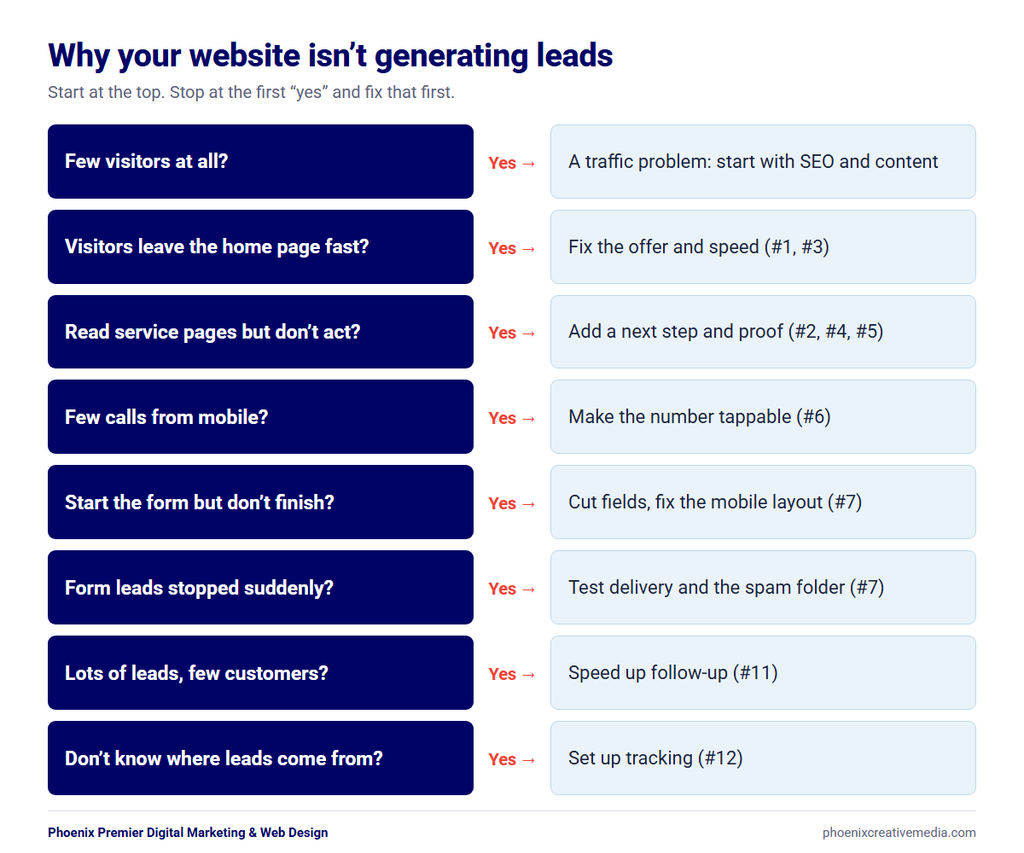
If your site gets traffic but few leads, the cause is usually one of a handful of problems. Use this table to find yours:
| Symptom | Likely cause | Fix (element) |
| Visitors leave fast from the home page | Unclear offer, slow load | #1, #3 |
| Visitors read service pages but don’t act | No clear next step, no proof near the CTA | #2, #4, #5 |
| Few calls from mobile | Number not tappable or hidden | #6 |
| Visitors start the form but don’t finish | Too many fields, poor mobile layout | #7 |
| Form leads stopped suddenly | Broken form delivery or spam folder | #7 (test it) |
| Lots of leads, few customers | Slow follow-up | #11 |
| You don’t know where leads come from | No tracking | #12 |
| Few visitors at all | A traffic problem, not a design problem | SEO and content |
The last row matters. A lead generation website turns visitors into leads, but it can’t create visitors. If traffic is the problem, start with an SEO audit. If people now find you through Google’s AI answers, see our Google AI Overview optimization services. For more common design problems, see the top 10 website design mistakes Phoenix small businesses make.
Lead generation form examples by industry
The right form depends on how urgent the need is and how complex the job is. Here are starting points for common service businesses:
| Industry | Main lead path | Suggested form fields |
| HVAC | Click-to-call, then a short form | Name, phone, service needed (repair, install, maintenance), ZIP code |
| Plumbing | Click-to-call | Name, phone, problem (dropdown), “Is it an emergency?” |
| Law firm | Free consultation form or call | Name, phone, email, practice area, short description |
| Home remodeling | Multi-step quote form | Project type, rough budget range, timeline, then contact details |
| Chiropractor | Online booking | Name, phone, email, new or returning patient, preferred time |
| Moving company | Multi-step quote form | Moving from/to ZIP, move date, home size, then contact details |
Industry websites need industry-specific details. See how we approach plumbing website design and law firm website design.
Lead generation website design FAQs
What is a lead generation website?
A lead generation website is a site designed to turn visitors into inquiries, such as calls, form submissions, bookings, or quote requests, that a business can follow up on. Every page gives visitors a clear next step.
What makes a high-converting website?
A high-converting website makes a clear offer, loads fast on mobile, shows proof near every call to action, and makes the next step easy, whether that’s a call, a short form, or a booking. It also tracks which of those paths visitors use.
Where should a lead generation website feature its phone number?
Put it in the top right of the header on every page as a tappable click-to-call link. On mobile, add a sticky call bar, and show the number next to forms and in the hero section of service pages.
How do I make a contact form for my website?
On WordPress, use a form plugin, keep the form to the few fields you need to follow up, add clear labels and autocomplete, and send submissions to an inbox someone checks. Then test it from your phone to make sure the email arrives.
What are alternatives to a contact form?
Click-to-call, online booking, multi-step quote forms, live chat or a chatbot, text messaging or WhatsApp, estimate calculators or quizzes, and lead magnets such as a free checklist. Most businesses do best with two or three of these, matched to how their customers like to get in touch.
What is the difference between a lead generation website and a landing page?
A landing page is one focused page for one offer, often built for an ad or campaign. A lead generation website applies the same thinking to every page, and gives visitors more than one way to get in touch.
How many fields should a lead generation form have?
As few as you need to follow up. For most service inquiries, that’s a name, a phone number or email, and the service needed. Ask for more only when the visitor is close to buying, such as on a quote request, and consider a multi-step form.
Why is my website not generating leads?
Usually because of an unclear offer, no visible next step, a hard-to-use mobile form, a phone number that isn’t tappable, or a broken form. If very few people visit at all, the problem is traffic, which needs SEO rather than design.
How do I track leads from my website?
Mark form submissions, phone-number taps, and bookings as key events in Google Analytics 4. Add call tracking if many of your leads phone in, and review the numbers each month alongside Search Console.
Turn your website into your best lead source.
A lead generation website isn’t one big change. It’s a dozen small ones: a clear offer, proof where it counts, a phone number that taps, a form people finish, and someone who answers fast. Start with the problem in the table above that sounds most like your site, and fix that first.
If you’d like help, Phoenix Premier designs custom, responsive WordPress websites for businesses across Arizona, and can also handle the SEO, Google Business Profile, and GA4 setup around them. See our web design services in Phoenix, or start with a free SEO audit. Robert will personally email you to set up a review session. Prefer to talk? Call (480) 442-9829 or contact us.